officehourslive
patreon
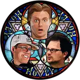
What do you think? Working on merch too, stay tuned!
EDIT: Crap! forgot to thank Justin McGuire for helping with this. Buy some of his super cool art here: https://www.etsy.com/shop/JustinsArtStore

Needs more orange and outright lies
Can't wait for shirts!!!
Working on it, JACK!
WOW
Hi! I’ll wear this! Where can I buy?
mock up: https://imgur.com/f4xDIn8
Maybe some Office Hours bottled Holy Water? :)
plz make/bake office hours communion wafers
Thanks for the shout out! 🤗
Or maybe if the holy trinity graphic was a touch smaller, the title size were a bit larger and with a smidge more separation from the center trinity graphic that might make it more eye catching and identifiable.
I like. If the font for the “Office Hours” type were thicker or more bold it might pop better especially when looking at it from a bit of a distance. I think if the font style has too thin of lettering and it’s the color black (which is represented in the dividing lines within the holy trinity image) it is harder to read/doesn’t jump out as much as a bold title.
OH git picks! https://www.jimdunlop.com/custom-picks/
not true
I made this
Hot sauce
Yes much improvement
Very cute!
I dig the logo, but add orange spray tan with white raccoon eyes to that same photo of Tim
I like it, it’s very nice and very clean!
On a mug bigger than 11oz plz. Great job
I just heard an angels choir 🙏
Omfg merch 🤯👏
Yeah this is a banger.